Joshua Joel Cuevas

Introduction
Hi, I'm Josh. A recent graduate with passions in economics, data science, ML and cloud computing.
"This intersection therefore is the use of AI to organize and create insights from huge data through cloud computing and will be something many companies will likely be incorporating in the future."
View My LinkedIn Profile
Urban Pulse: Decoding NYC’s Taxi Tapestry - Features, Imputations, Correlations and Regression models.
Project description: Building A/B testing to work on predicting the taxi fare amounts. Working through feature engineering to eventually building a multiple linear regression model.
1. EDA and Hypothesis Testing
Analyzing the Relationship Between Fare Amount and Payment Type for NYC TLC through A/B tests. The goal is to create A/B test results to find ways to generate more revenue for taxi cab drivers. Null Hypothesis: No average fare difference between credit card and cash users. Alternative Hypothesis: Average fare differs between credit card and cash users.
#hypothesis test, A/B test
#significance level

credit_card = taxi_data[taxi_data['payment_type'] == 1]['fare_amount']
cash = taxi_data[taxi_data['payment_type'] == 2]['fare_amount']
stats.ttest_ind(a=credit_card, b=cash, equal_var=False)
TtestResult(statistic=24.001590159839903, pvalue=8.786609175537095e-127, df=69652.62095524809)
P-value is significantly smaller than 5%, therefore, there is a statistically significant difference in the average fare amount between customers who use credit cards and customers who use cash.
2. Insights
1) Encouraging credit card payments can boost revenue for taxi drivers.
2) This project assumes passengers were randomly assigned payment methods. However, the dataset lacks consideration for factors like trip length influencing payment type, suggesting fare amount may dictate payment method more than the other way around.
3. EDA & Checking Model Assumptions
Analyze and discover data, looking for correlations, missing data, outliers, and duplicates.
df = df0.copy()
print(df.shape)
df.info()
print('Shape of dataframe:', df.shape)
print('Shape of dataframe with duplicates dropped:', df.drop_duplicates().shape)
print('Total count of missing values:', df.isna().sum().sum())
print('Missing values per column:')
df.isna().sum()
Shape of dataframe: (100000, 17) Shape of dataframe with duplicates dropped: (100000, 17) Total count of missing values: 0 Missing values per column:
Unnamed: 0 0 tpep_pickup_datetime 0 tpep_dropoff_datetime 0 passenger_count 0 trip_distance 0 RatecodeID 0 store_and_fwd_flag 0 PULocationID 0 DOLocationID 0 payment_type 0 fare_amount 0 extra 0 mta_tax 0 tip_amount 0 tolls_amount 0 improvement_surcharge 0 total_amount 0 dtype: int64
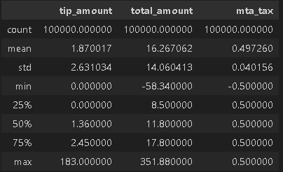
We’ve got outliers, like a hefty $200 tip and a whopping $1,200 total amount. Plus, some variables, like mta_tax, are pretty much stuck in one place, not bringing much prediction power.
# Display descriptive stats about the data
df.describe()
df[["tip_amount","total_amount","mta_tax"]].describe()
Convert pickup & dropoff columns to datetime and create duration column
# Convert datetime columns to datetime
# Display data types of `tpep_pickup_datetime`, `tpep_dropoff_datetime`
print('Data type of tpep_pickup_datetime:', df['tpep_pickup_datetime'].dtype)
print('Data type of tpep_dropoff_datetime:', df['tpep_dropoff_datetime'].dtype)

# Convert `tpep_pickup_datetime` to datetime format
df['tpep_pickup_datetime'] = pd.to_datetime(df['tpep_pickup_datetime'])

# Convert `tpep_dropoff_datetime` to datetime format
df['tpep_dropoff_datetime'] = pd.to_datetime(df['tpep_dropoff_datetime'])

# Display data types of `tpep_pickup_datetime`, `tpep_dropoff_datetime`
print('Data type of tpep_pickup_datetime:', df['tpep_pickup_datetime'].dtype)
print('Data type of tpep_dropoff_datetime:', df['tpep_dropoff_datetime'].dtype)

# Create `duration` column
df['duration'] = (df['tpep_dropoff_datetime'] - df['tpep_pickup_datetime'])/np.timedelta64(1,'m')
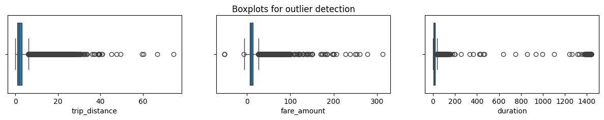
4. Box Plots
1) All three numbers have some weird values. Some are really out there, others not so much. 2) The distance from Staten Island to Manhattan is about 30 miles in a straight line. Considering this and how the numbers are spread, it makes sense to let them be. But, fare_amount and duration have some wonky high values. 3) Maybe it’s cool for the last two, but for trip_distance, it’s a bit iffy.
fig, axes = plt.subplots(1, 3, figsize=(15, 2))
fig.suptitle('Boxplots for outlier detection')
sns.boxplot(ax=axes[0], x=df['trip_distance'])
sns.boxplot(ax=axes[1], x=df['fare_amount'])
sns.boxplot(ax=axes[2], x=df['duration'])
plt.show();
5. Imputations
Some trip distances show up as 0. Are these mistakes or just super short rides getting rounded down? Sometimes passengers bail, making the distance zero. Just to check, let’s see how many rides actually have a trip_distance of zero. Only 148 out of around 23,000 rides have a zero distance. Tiny, right? You could slap on a 0.01 for them, but it won’t shake up the model much. So, we’ll just let the trip_distance column be.
sorted(set(df['trip_distance']))[:10]
sum(df['trip_distance']==0) #642
[0.0, 0.01, 0.02, 0.03, 0.04, 0.05, 0.06, 0.07, 0.08, 0.09] 642
Fare_amount outliers and Cleanup:
Low values: Negatives are a no-go, but zeros are fine if the trip got axed right away.
High values: The max fare hits almost a grand, which is fishy. So, let’s cap the crazies using intuition and statistics. The IQR math says stop at $26.50, but that feels off. We’ll use a factor of 6, which results in a cap of $62.50.
AKA Impute the maximum value as Q3 + (6 * IQR).
def outlier_imputer(column_list, iqr_factor):
    '''
    Impute upper-limit values in specified columns based on their interquartile range.

    Arguments:
        column_list: A list of columns to iterate over
        iqr_factor: A number representing x in the formula:
                    Q3 + (x * IQR). Used to determine maximum threshold,
                    beyond which a point is considered an outlier.

    The IQR is computed for each column in column_list and values exceeding
    the upper threshold for each column are imputed with the upper threshold value.
    '''
    for col in column_list:
        # Reassign minimum to zero
        df.loc[df[col] < 0, col] = 0

        # Calculate upper threshold
        q1 = df[col].quantile(0.25)
        q3 = df[col].quantile(0.75)
        iqr = q3 - q1
        upper_threshold = q3 + (iqr_factor * iqr)
        print(col)
        print('q3:', q3)
        print('upper_threshold:', upper_threshold)

        # Reassign values > threshold to threshold
        df.loc[df[col] > upper_threshold, col] = upper_threshold
        print(df[col].describe())
        print()

outlier_imputer(['fare_amount'], 6)
count 100000.000000 mean 12.943215 std 11.362632 min -52.000000 25% 6.500000 50% 9.500000 75% 14.500000 max 312.500000 Name: fare_amount, dtype: float64
q3: 14.5 upper_threshold: 62.5 count 100000.000000 mean 12.851976 std 10.589691 min 0.000000 25% 6.500000 50% 9.500000 75% 14.500000 max 62.500000 Name: fare_amount, dtype: float64
6. Feature Engineering
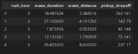
When the model’s out in the wild, it won’t predict trip duration upfront. But we can use known trip stats to make educated guesses. Let’s use a mean_distance column by grouping trips by pickup and dropoff points, calculating averages, to create new insights!
def rush_hourizer(hour):
    if 6 <= hour['rush_hour'] < 10:
        val = 1
    elif 16 <= hour['rush_hour'] < 20:
        val = 1
    else:
        val = 0
    return val
df['pickup_dropoff'] = df['PULocationID'].astype(str) + ' ' + df['DOLocationID'].astype(str)
grouped = df.groupby('pickup_dropoff').mean(numeric_only=True)[['trip_distance']]
grouped_dict = grouped.to_dict()
grouped_dict = grouped_dict['trip_distance']
df['mean_distance'] = df['pickup_dropoff']
df['mean_distance'] = df['mean_distance'].map(grouped_dict)
grouped = df.groupby('pickup_dropoff').mean(numeric_only=True)[['duration']]
grouped_dict = grouped.to_dict()
grouped_dict = grouped_dict['duration']
df['mean_duration'] = df['pickup_dropoff']
df['mean_duration'] = df['mean_duration'].map(grouped_dict)
df['day'] = df['tpep_pickup_datetime'].dt.day_name().str.lower()
df['month'] = df['tpep_pickup_datetime'].dt.strftime('%b').str.lower()
# Create 'rush_hour' col
df['rush_hour'] = df['tpep_pickup_datetime'].dt.hour
# If day is Saturday or Sunday, impute 0 in `rush_hour` column
df.loc[df['day'].isin(['saturday', 'sunday']), 'rush_hour'] = 0
# Apply the `rush_hourizer()` function to the new column
df.loc[(df.day != 'saturday') & (df.day != 'sunday'), 'rush_hour'] = df.apply(rush_hourizer, axis=1)
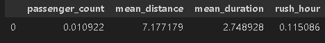
df[["rush_hour","mean_duration","mean_distance", "pickup_dropoff"]].head()
7. Scatter plots, pair plots and correlation tables/heatmaps
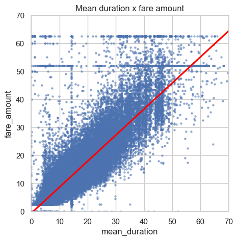
a scatterplot to visualize the relationship between mean_duration and fare_amount
sns.set(style='whitegrid')
f = plt.figure()
f.set_figwidth(5)
f.set_figheight(5)
sns.regplot(x=df['mean_duration'], y=df['fare_amount'],
            scatter_kws={'alpha':0.5, 's':5},
            line_kws={'color':'red'})
plt.ylim(0, 70)
plt.xlim(0, 70)
plt.title('Mean duration x fare amount')
plt.show()
After dropping features that are redundant and irrelevant or won’t be avaible in a deployed enviroment I create a pairplot to visualize pairwise relationships between fare_amount, mean_duration, and mean_distance.
sns.pairplot(df2[['fare_amount', 'mean_duration', 'mean_distance']],
             plot_kws={'alpha':0.4, 'size':5},
             )
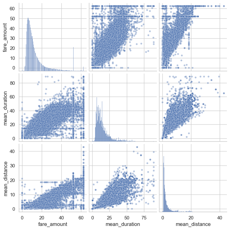
Next we should create a correlation matrix to help determine most correlated variables.
print(df2.corr(method='pearson'))
# Create correlation heatmap

plt.figure(figsize=(6,4))
sns.heatmap(df2.corr(method='pearson'), annot=True, cmap='Reds')
plt.title('Correlation heatmap',
          fontsize=18)
plt.show()

8. Constructing the model
Preproccessing. Splitting data into outcome variable and features. Standardizing data.
# Remove the target column from the features
X = df2.drop(columns=['fare_amount'])

# Set y variable
y = df2[['fare_amount']]

# Get dummies
X = pd.get_dummies(X, drop_first=True)
# Create training and testing sets

X_train, X_test, y_train, y_test = train_test_split(X, y, test_size=0.2, random_state=0)
# Standardize the X variables
scaler = StandardScaler().fit(X_train)
X_train_scaled = scaler.transform(X_train)
print('X_train scaled:', X_train_scaled)
Fitting the model to the training data.
# Fit your model to the training data
lr=LinearRegression()
lr.fit(X_train_scaled, y_train)
Evaluating the model on train data and test data
Train data
# Evaluate the model performance on the training data
r_sq = lr.score(X_train_scaled, y_train)
print('Coefficient of determination:', r_sq)
y_pred_train = lr.predict(X_train_scaled)
print('R^2:', r2_score(y_train, y_pred_train))
print('MAE:', mean_absolute_error(y_train, y_pred_train))
print('MSE:', mean_squared_error(y_train, y_pred_train))
print('RMSE:',np.sqrt(mean_squared_error(y_train, y_pred_train)))
Coefficient of determination: 0.8379324295648474 R^2: 0.8379324295648474 MAE: 2.3323595594005897 MSE: 18.270924842792795 RMSE: 4.2744502386614345
Test data
X_test_scaled = scaler.transform(X_test)
# Evaluate the model performance on the testing data
r_sq_test = lr.score(X_test_scaled, y_test)
print('Coefficient of determination:', r_sq_test)
y_pred_test = lr.predict(X_test_scaled)
print('R^2:', r2_score(y_test, y_pred_test))
print('MAE:', mean_absolute_error(y_test,y_pred_test))
print('MSE:', mean_squared_error(y_test, y_pred_test))
print('RMSE:',np.sqrt(mean_squared_error(y_test, y_pred_test)))
Coefficient of determination: 0.8378668322065665 R^2: 0.8378668322065665 MAE: 2.3267246851541388 MSE: 17.793089610596432 RMSE: 4.218185582759065
9. Visualizing Model Results
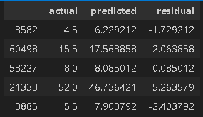
Results for actual,predicted, and residual for the testing set.
# Create a `results` dataframe
results = pd.DataFrame(data={'actual': y_test['fare_amount'],
                             'predicted': y_pred_test.ravel()})
results['residual'] = results['actual'] - results['predicted']
results.head()
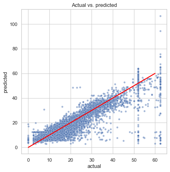
Scatterplot for Actual versus Predicted data points
# Create a scatterplot to visualize `predicted` over `actual`
fig, ax = plt.subplots(figsize=(6, 6))
sns.set(style='whitegrid')
sns.scatterplot(x='actual',
                y='predicted',
                data=results,
                s=20,
                alpha=0.5,
                ax=ax
)
# Draw an x=y line to show what the results would be if the model were perfect
plt.plot([0,60], [0,60], c='red', linewidth=2)
plt.title('Actual vs. predicted');
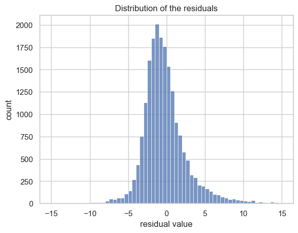
Visualize the distribution of the residuals using a histogram
The leftover variance, aka residuals, dances in a nearly normal distribution with an average of -0.015.
This means our model’s errors play fair, spread evenly, and keep things unbiased.
# Visualize the distribution of the `residuals`
sns.histplot(results['residual'], bins=np.arange(-15,15.5,0.5))
plt.title('Distribution of the residuals')
plt.xlabel('residual value')
plt.ylabel('count');
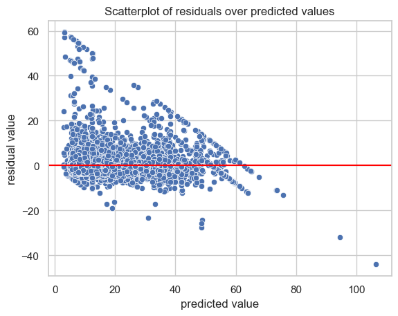
Create a scatterplot of residuals over predicted.
Residuals extist above and below zero, which is expected. Those sloping lines are from the $62.50 cap and $52 JFK flat rate we plugged in.
# Create a scatterplot of `residuals` over `predicted`

sns.scatterplot(x='predicted', y='residual', data=results)
plt.axhline(0, c='red')
plt.title('Scatterplot of residuals over predicted values')
plt.xlabel('predicted value')
plt.ylabel('residual value')
plt.show()
10. Coefficients
The heavy hitter in the prediction game is mean_distance. But, hold your horses! Don’t fall for the trap. It’s not a simple “for every mile” tale. Nope! We used StandardScaler() on our training data, so the units are in standard deviations, not miles. So, it’s more like, “for every +1 change in standard deviation,” the fare dances up by $7.13.
we didn’t kick out some pesky correlated features, so the confidence interval is a bit shaky.
# Get model coefficients
coefficients = pd.DataFrame(lr.coef_, columns=X.columns)
coefficients

print(X_train['mean_distance'].std())
print(7.133867 / X_train['mean_distance'].std())
3.600633254666103 1.9812812067863723
11. Follow up
More work must be done to prepare the predictions to be used as inputs into the model. Specifically, imputing constant fare rate of $52 for all trips with rate code “2.”